
RedDakooter05
Well-Known Member
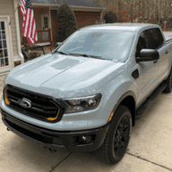
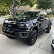
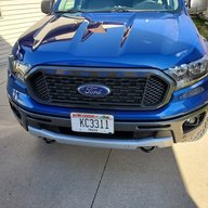
The one thing I never liked is the gap around the emblem. Wish they designed it to either hug the ford logo tighter, or perhaps even went over(requiring removal of the logo) and had its own camera lens housing rigging.
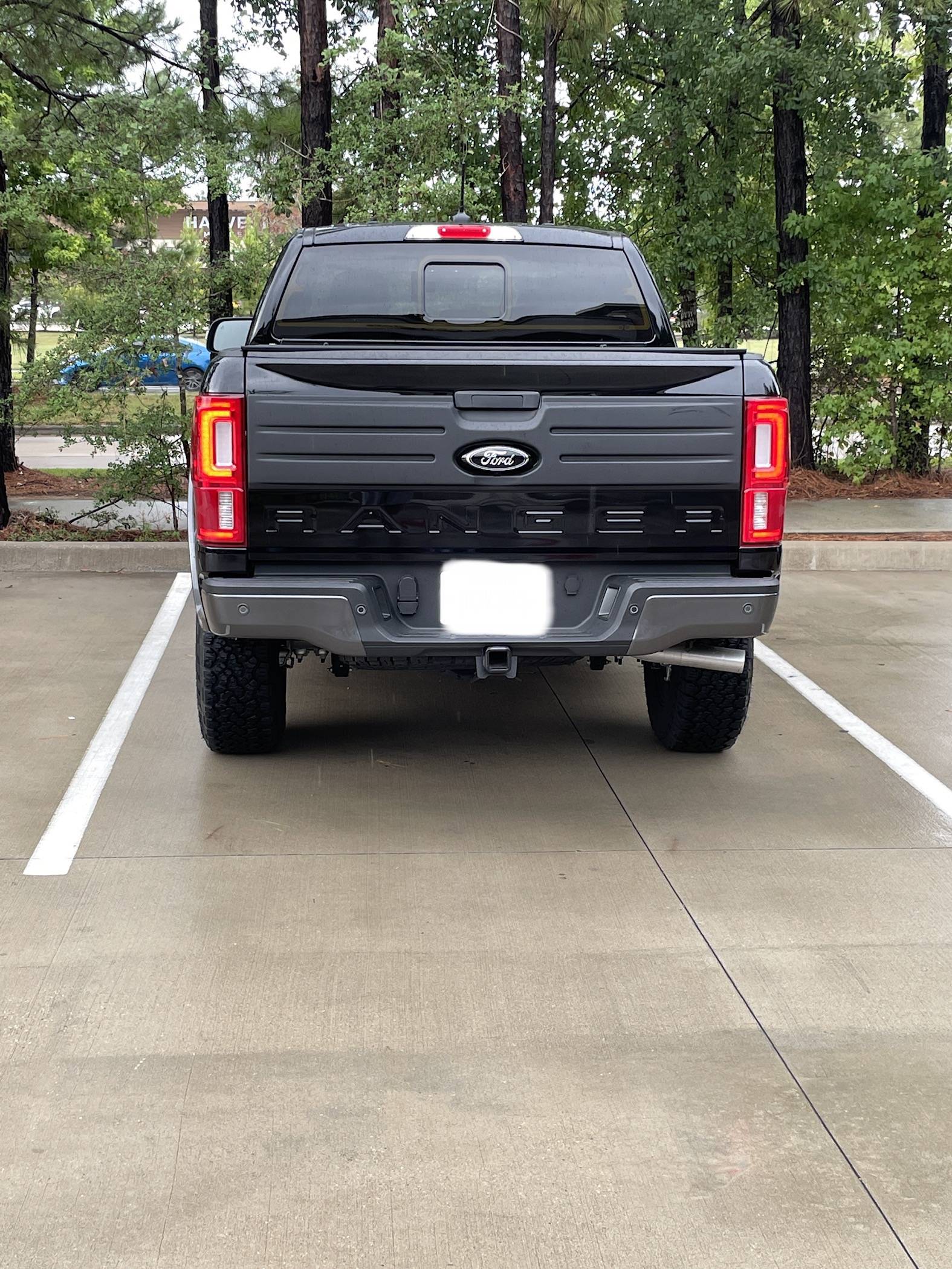
To be, its a great add-on but that small issue is a deal breaker for me. Not knocking you of course, just the final design.
Sponsored